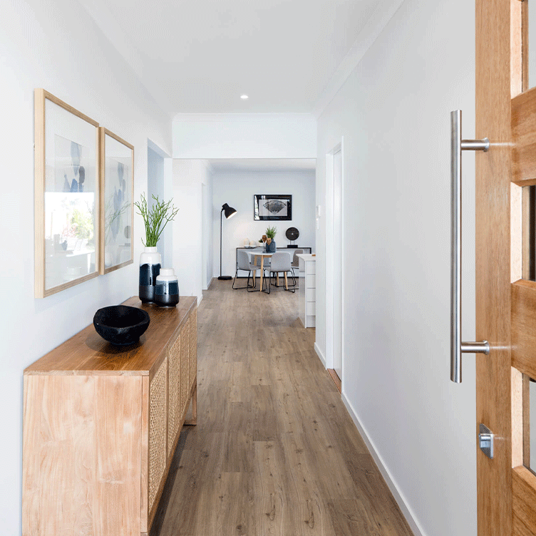
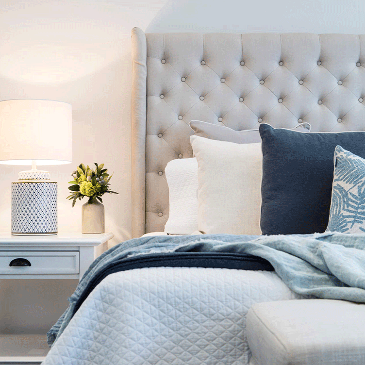
So what’s hot and what’s not for 2022? Much like 2021, interior colour trends continue to feature bold, brave hues. Not surprisingly, the pandemic has influenced colour trends greatly, with emphasis on creating cosy, calm and comforting spaces – a happy place to feel safe and secure. The outside world has been a pretty grey and gloomy place over the past couple of years, so our homes really have become our sanctuaries. Here, we look at the trending colours of 2022 including the ‘Pantone Colour of the Year’, the psychology of colour and how it can affect your mood.
When it comes to colour, we ‘re definitely not playing it safe anymore. Grey, cream and white aren’t as prominent as they once were. Instead, we’re seeing more vibrant colours, such as orange, green, pink and yellow. Even red has made a big comeback. After living through a pandemic, often with long periods of lockdown, people want to bring life and energy into their homes – and colour is an easy and inexpensive way to do it. So if you’re looking for inspiration for your new home, here are some of the hottest interior design colour trends and tips for 2022.
2022 is all about colours that make you feel good. Forget about being on trend, and just go with what you love. Create rooms filled with colours that reflect your personal style and give you an instant boost. Dreamy blue and purple tones that create calm, bright and breezy yellows, and playful pinks all create ‘feel good’ interiors. As home organisation expert, Marie Kondo would say, we want our homes to ‘spark joy’, especially when we are spending so much more time in them.


Once reserved for decorating children’s rooms, colours like yellow, lilac, tangerine and pink are now being used throughout our interiors in a more thoughtful, sophisticated way. And they’re not just being seen in bedrooms, as you might expect. Muted variations of these shades are featuring in our living areas, bringing positivity and warmth into our homes and lifting our spirits.
In 2022, we continue to be inspired by nature, so green is still a popular colour trend. Evoking feelings of reassurance, rest and security, green is a powerful colour that puts the mind at ease. More than ever, people are trying to create a calm atmosphere in their homes, amidst great uncertainty.
Blue is a staple in colour trends every year – it just takes on a slightly different form. It’s such a timeless, familiar colour, no wonder we are drawn to it year after year. In 2022, deeper, darker shades of blue are being embraced. And we’re not just bringing it into our homes through furniture and accessories. Many design-conscious home owners are going all out by featuring an inky shade of blue on their interior walls to create a dramatic, cocooning room.
Move over grey! Earthy tones are overtaking cool neutrals. Adding warm shades like terracotta, ochre and even beige, reflect our desire to make our homes feel more comforting and inviting. There is also a 70s vibe going on, with the revival of shades of orange. The earthy terracotta tones that have been on trend for the past couple of years are being complemented by classic 70s palettes, including rich brown and caramel, with bold pops of pink and orange.
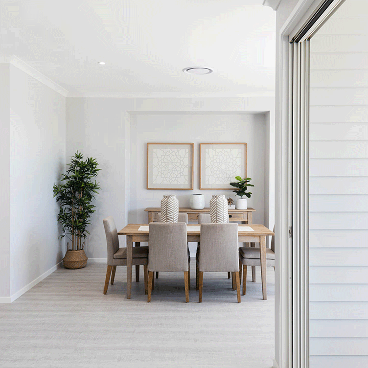
This trend is all about creating warm, cosy spaces that feel intimate and inviting. Natural, stony tones paired with soft, welcoming greens provide a restful alternative to cooler choices. These gentle neutrals can be used in all areas of the home to add warmth, as well as providing a sophisticated backdrop for fabrics, window coverings and soft furnishings.
Every year, the Pantone Colour Institute chooses a Colour of the Year – a snapshot of what colour experts see taking place in the world of colour, that expresses a mood and an attitude. Essentially, this colour sets trends for things like design accents, paint, soft furnishings and homewares, in much the same way as fashion trends affect the clothes we buy each season. The Colour of the Year for 2022 is Pantone 17-3938, otherwise known as Very Peri. Said to ‘encourage personal inventiveness and creativity’, Very Peri is a beautiful, periwinkle blue with a violet-red undertone – perfect for creating a calm, dreamy feel.
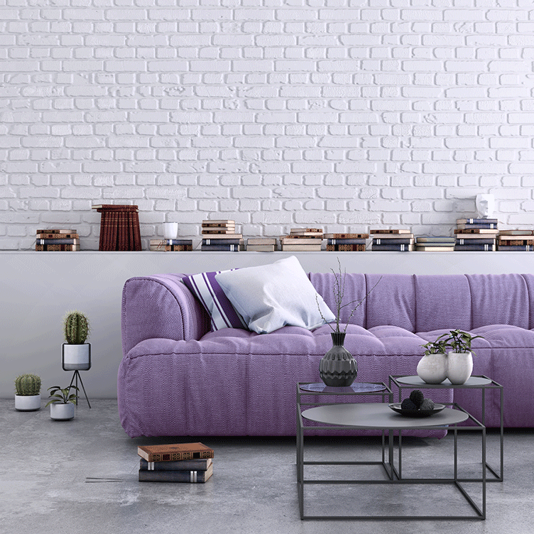
While blue induces a calming effect, violet and lilac tones are often used to represent wellness, relaxation and meditation – and we all need that right now! Although this colour can be a little daunting to style, incorporating accessories such as vases, candles and artwork, are great ways to feature this beautiful colour in your space, without making a huge commitment.
If you love bright colours, but going bold on the walls is too much for you, try choosing strong colours for key furniture pieces instead. It’s an easy way to create impact, without overpowering the space. A colour making a big comeback this year is primary red. Its clean notes provide a timeless vintage feel, especially in modern interiors. Consider adding a red occasional chair and pops of red in accessories such as cushions and throws, for an inexpensive way to introduce this bold hue.
At Hallmark Homes, our Selection Centre Consultants are experts when it comes to home décor colour and design trends. They will personally guide you through all your colour selections, ensuring that everything you choose works together seamlessly, both inside and out. They will also help you with all of your choices when it comes to appliances, finishes, fixtures plus much more. Our Selection Centre, Select by Hallmark, is exclusive to Hallmark Homes’ clients, and entry is by appointment only.
Along with Select by Hallmark, you’ll also find exciting ideas that spark your imagination for your new home on our Inspiration Gallery pages. Here you’ll find inspiration for the kitchen, dining, living room, bedrooms, bathroom, activity rooms and home office, and you may even find ideas to help you maximise your alfresco space and make the most of the Southeast Queensland weather! Our Inspiration Gallery also showcases a variety of styles, including Contemporary, Coastal, Farmhouse, Mediterranean and Mid-Century Modern, and you can view videos of all our current display homes.
So if you’re thinking of building a new home in South East Queensland, contact Hallmark Homes to speak with an experienced consultant. Come and visit one of our display centres or check out our virtual tours and house plans from the comfort of your own home. If you have any questions about our single storey, double storey, acreage, narrow lot, home designs, or house and land packages, please contact us today.